
Revampification
 After two months of editing, thinking, fooling around and eventually solving the mysteries of HTML, my blog has finally reached its complete state (or at least version 1 of the complete state.)
The process of deciding what my header should look like wasn’t really easy. I wanted the title to be bright and it had to be able to stick out from the rest of the page. It’s the attention catcher when the page first opens. You see the title – Travails of Life – and you know exactly what I’m going to be rambling about.
But there were two different headers that I made that I really liked;
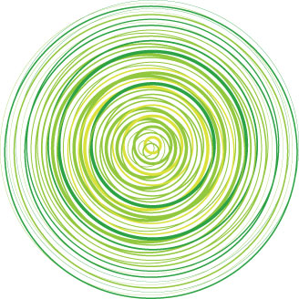
† The first one I made was composed of a render of a self-pic that I took in my bathroom (I was posing and doing nothing else.) The background was created using the Xbox 360 logo and tweaking it like crazy. I added some tile-reflection to make that grungy looking effect and the font gave it that mean look. Overall, it was a bright, eye-catching piece that made me look like a murderer with more problems than just running from the law.
The Picture
The Background
The Final Product
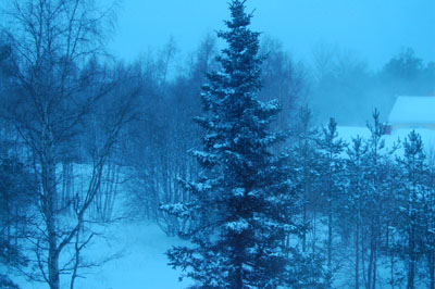
† The second one was another self-pic (I’m not vain. I only do it for the blog!) which I rendered. I wanted this one to look a little mellower than the first one. The background was some snowy field that I found. Using transparency, layering, and my brain, I managed to end up with the title image for this post.
The Picture
The Background
The Final Product
Well I was pretty clueless on which one actually looked better overall. I asked 3 friends who all said that the green background was much cooler and the effect of the second image was better. And that the second picture didn’t make me look so evil. So what do you do? Amalgamate, my friends… Amalgamate.
Voila. There you go… The header of this blog was thus created!
Right from the start, however, uploading the image as the header seemed to be the biggest obstacle. With my knowledge of coding (zilch) and with failed attempts of aid from my friends, I decided that I’ll go over the source-codes of several blogs and try to understand what was wrong. After editing the code at least 20 times in the span of 2 hours, I finally got it to work. I just changed the background colour and made some minor changes here and there and hey, we were left with the ‘revampification’ of my blog!
Comments please~
*Edit 1*: I've redone the header image once again as the previous one made me look like some sort of reptile. If you didn't see the previous one, and you are curious as to what sort of reptile I resembled, click on this link to see what I mean:
Snake Boi
*Edit 2*: I've chosen a higher contrast and brighter green header. And to add to my blog's rebirth, I've given it its very own favicon. That's the tiny image that appears next to the URL. Yay!
![]()


8 comments:
OMG! that pic looked worse in the original than in the attempted header!!
That's where the graphic design kicks in, my friend
the green background is way cooler... so is the concentric circles effect with the 360's logo... but i don't like the circles going across ur face in the new header!! how bout using the old header's face effect on the new header?
Yea, I look like a bloody reptile if you ask me.. Lemme see what I can do about that...
Done! ^_^
Your blending is a bit overboard, try retaining the opacity in the render and fade out the edges a little bit, that gives more of a focal point to your header.
Same thing goes for the winter-y one, and the text in that one acts as a focus because it's what is unblended. Try fading the text in, pulling the render out and getting that constipated smile off your face :D
I have no idea what you meant about the first image.. but i know what you're talkin bout in the second one..
and shaddap, i happen to like that smile on my face. constipated i believe! =/
Anyway.. out of these three which one really looks the best? the first two almost look the same.. its just that in the second one my face is slightly greener. the first one is the original. and the last one is slightly darker...
http://img159.imageshack.us/img159/3395/greentravails2zx0.jpg
http://img129.imageshack.us/img129/4937/greentravails4bw3.jpg
http://img249.imageshack.us/img249/3517/greentravails3we9.jpg
Pic 1
Pic 2
Pic 3
Post a Comment